Ship Builder
Design Practice

*I’ve come a long way since this practice and would like to revisit the visuals.
Solo Practice // My Role: UX/UI Designer & Researcher
Contributions:
Competitive analysis
Conducting user research
Sketching solutions
Creating wireframes, flows and UI mockup
Tools:
Pen & Paper
Figma
Overview
The Task:
Create an interface design for an imaginary space game. Players must be able to customize their spaceship. Without specifics for the game type, art themes, or gameplay, I chose to start modeling this off of the Stellaris shipbuilder and blending it with some other ship builders.
The Results:
In under a week, I designed a ship builder tool for players to easily view and customize ships, meeting all needs and giving players the info to customize their fleet for their game plan. In the future, I also want to let players customize their ships to make them unique and stand out in multiplayer.
ASks for this task:
Font: Min size: Arial Regular 14px or similar
Resolution: Min resolution: 1280 x 720 (iMac frame), Desktop: 1440 x 1024
Show Ship Selection & List of Stats:
Damage, Armor, Power (used/remaining), Speed, HP, Shields
8 weapon slots, 6 utility slots
Should see list of components valid for equip slots
See effects of components
Save, Load, Rename Template
Tooltips for help
The Approach:
Interviewing Stellaris Players
Analyzing Other Ship Builders & Customizations
Exploring Layouts & User Flows for Customization
4. Viewing, Comparing & Editing Ships
5. Extra Thoughts
Interviewing stellaris players
For the amount of time given, I interviewed 2 Stellaris players to get an idea of their use, comprehension, and frustrations with the ship customization builder in this game. One had just started their first experience with the game, the other having 150+ hours already and a fan of strategy games.
Some of the major feedback :
Both were confused about which ship upgrades were best and why they should be used.
They were unsure where new ship customizations could go on the ship.
Finding the components menus was a confusing experience.
The more experienced player felt proud of the naming of his ship fleet, “Banana Republic”.
2. Analyzing Other Ship Builders & Customizations
I checked out customization features in various games like Battletech, Kerbal Space Program, and Stellaris to see what they offer in terms of layout and content.
Battletech SHIP & Mech Customization
I enjoyed the blueprint view of the ship. It also help point out where upgrades would go to give context to their functions, which was one area that could use improvement on the Stellaris experience.
I looked at 2 different areas for Mech customization, Skirmish & Campaign modes.

Breakdown of Mech Customization
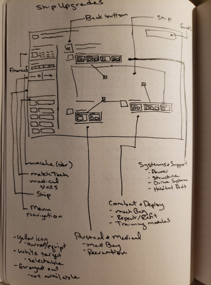
Ship Upgrades: Sketching the different components and layouts
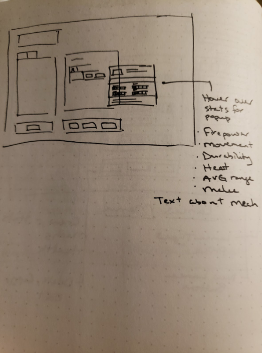
Tooltips: Hovering over different mechs presented stats for comparisons
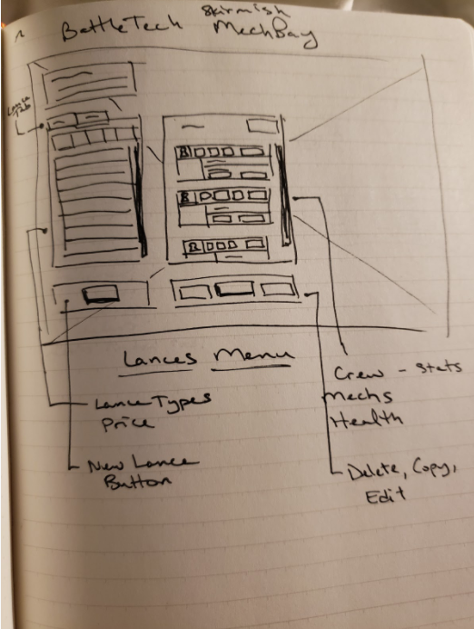
Skirmish Mech Bay: Right side was kept open to view the Mech Bay environment

Sorting: Options for viewing parts & mechs
Kerbal Space Program
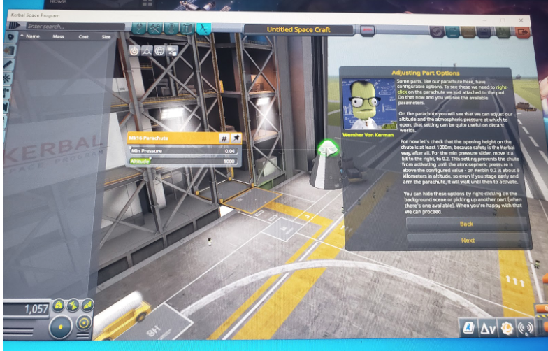
Looking at a game that is largely dedicated to building ships, I tried out a bit of Kerbal Space Program to see what options they presented for layout and customization.
The VAB allowed for a 3D view of the ship and relied more on player interaction for construction.
Breakdown of VAB Elements

Layout: The ship is in the middle with plenty of room to explore and play with the 3D model.
Tools & Settings: Search, game settings, and naming always available.
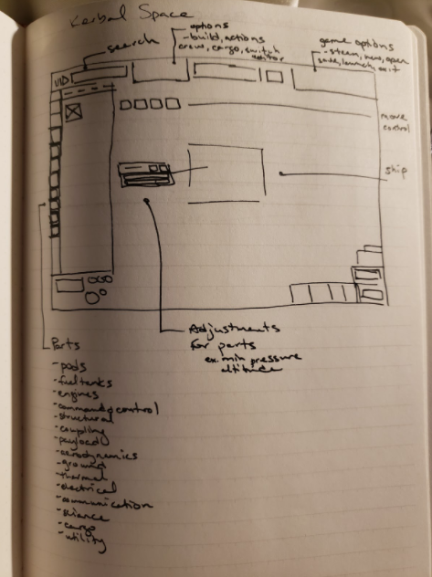
Parts: Organized on the left side for easy access.
Tooltips: On hover, presented more info for individual parts.
3. Exploring Layouts & User Flows for Customization
In the interviews, I noted some issues to address and thought of various layouts. I sketched a few ideas for creating my own layout.
Although I really liked the idea of being able to view all the ships at once in the grid format, it didn’t seem the most efficient way to get comparisons for ships stats, which was a common theme in these ship builders. I went with the side menu and 3D model in the center.

Overall, the general flow could take you through 3 sections.
View
Edit Components
Customize Paint
This area is for looking at and changing the ships you already own, not for buying new ones elsewhere in the game.

4. Viewing, Comparing & Editing Ships
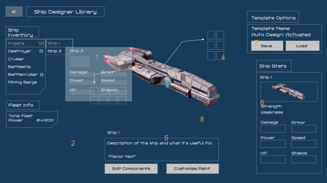
View/Compare Ships
List view of all ships in inventory
View overall power of your fleet at a glance
Compare stats on ships by hovering over ships and compare with selected ship
Quick view of equipped Weapons & Utilities
Description of the ship and why it’s useful
Easy way to view ship strength/weakness
Load saved template quickly
3D model of ship

Edit Components
Weapon/Utilities tab for each section & sorting by weapon/alpha/power
Component slots grow in size when selected
View of changes in Fleet and Ship stats when equipped
Description of weapon and what it’s good for
Ability to save/load/rename template
Hover over for quick view of other weapon stats for comparison
Weapon effects
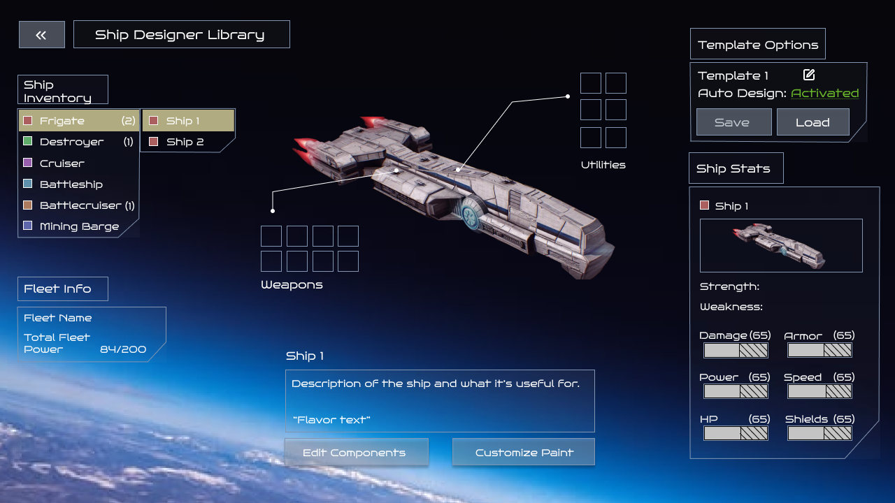
In Context
For fun, I wanted to see it cleaned up a little more
Environment background to give more of a setting
UI was kept simple and angular to give a Sci-Fi feel
5. Extra Thoughts
I would want to see more visual flourish when adding weapons/items. Maybe like visual highlighting on the model or zoomed in view on the ship area when selected.
Exploring personalization options could be fun for players to make it their own and help with fleet identification.
Displaying fleet power is crucial.
Currency and resources weren't included due to time constraints and lack of design clarification. I’d hope to work with the game designer to solidify thoughts on these before added them in as I’m sure both could be used in these menus.
Although hover overs show menus for stats in these examples, I definitely would want to make suer there is info for any terminology that could be confusing for new/returning players.
Next Steps
I would get in some prototype testing to see if the menus feel alright and are understandable to others. Any iterations of features would come after.
I would love to see a feature for painting your ship for a little ship personality and ownership for players.
Note: Looking back on these designs, I would definitely be making some visual adjustments. Headers, sizing, alignment and iconography could use some updates to give the ship more breathing space and simplify the screen.