call of duty + Activision franchises
Senior Researcher / UX Designer • Activision
2024-2025
Establishing Research-Driven Product Discovery for Lifecycle Marketing Experiences


Role◈
UX Design
User Research
Stakeholder Alignment
Discovery Planning
Team◉◌◉
Lifecycle Marketing
Analytics
Insights
Player Support
Brand
Development Partners
Platforms▣
Web
Mobile
Player-Facing Digital Experiences
Impact snapshot
Research Operations
Established the team's first structured research practice
Product Discovery
Introduced discovery processes for new initiatives
Cross-functional Alignment
Connected insights across Analytics, Brand, Support, and Product stakeholders
User Experience
Improved discoverability and player understanding across web experiences
Strategic Influence
Informed product and content decisions through player research
the challenge

Zombies are always a Challenge.
The Lifecycle Marketing and Digital Technology teams supported player-facing experiences across multiple Activision franchises.
While teams had access to large amounts of behavioral data, there was limited direct understanding of:
Player motivations
Friction points
Content discoverability issues
User needs across digital touchpoints
Research activities were often conducted on an ad hoc basis, making it difficult to consistently validate assumptions or identify emerging player needs across web and out-of-game experiences.
The opportunity was to introduce a repeatable discovery process that could help teams make more informed product decisions.

understanding the landscape
Landscape…or playground?
My first objective was to understand how decisions were currently being made and where knowledge gaps existed.
I partnered with stakeholders across:
Analytics
Player Support
Brand Teams
Product Stakeholders
External Partners
to understand:
Existing decision-making processes
Available data sources
Recurring player pain points
Opportunities for deeper player understanding
This work revealed that valuable information existed across multiple teams but was often disconnected.
Discovery framework
Validating Interactions with Data
Rather than treating each request as an isolated project, I established a repeatable discovery approach.
Research Inputs
Behavioral Analytics
User Interviews
Surveys
Usability Testing
Player Support Data
Stakeholder Workshops
Objectives
Validate assumptions
Reduce decision risk
Identify unmet player needs
Prioritize opportunities based on evidence
This created a foundation for more consistent product discovery and evaluation.
Key Insights

Knowledge is power.
Several themes emerged across studies.
Insight 1
Players frequently struggled to discover relevant information during seasonal content releases.
Important content often existed but was not easily surfaced.
Insight 2
Different player segments approached digital experiences with different goals.
New players often sought guidance and clarity, while experienced players prioritized speed and efficiency.
Insight 3
Support-related friction often appeared long before players contacted support teams.
By reviewing support trends alongside research findings, we could identify opportunities to improve self-service experiences.
Insight 4
Analytics explained what players were doing.
Research helped explain why.
Combining both perspectives produced stronger recommendations than either source alone.
from insights to action
Research findings informed improvements across multiple initiatives.
Examples included:
Information Architecture Improvements
Reorganized content structures to improve discoverability and reduce navigation friction.
User Guidance
Clarified pathways for players seeking game information, support resources, and seasonal content.
New Initiative Discovery
Conducted early-stage research to evaluate concepts before implementation.
Design Recommendations
Provided evidence-based recommendations to stakeholders responsible for roadmap and experience decisions.
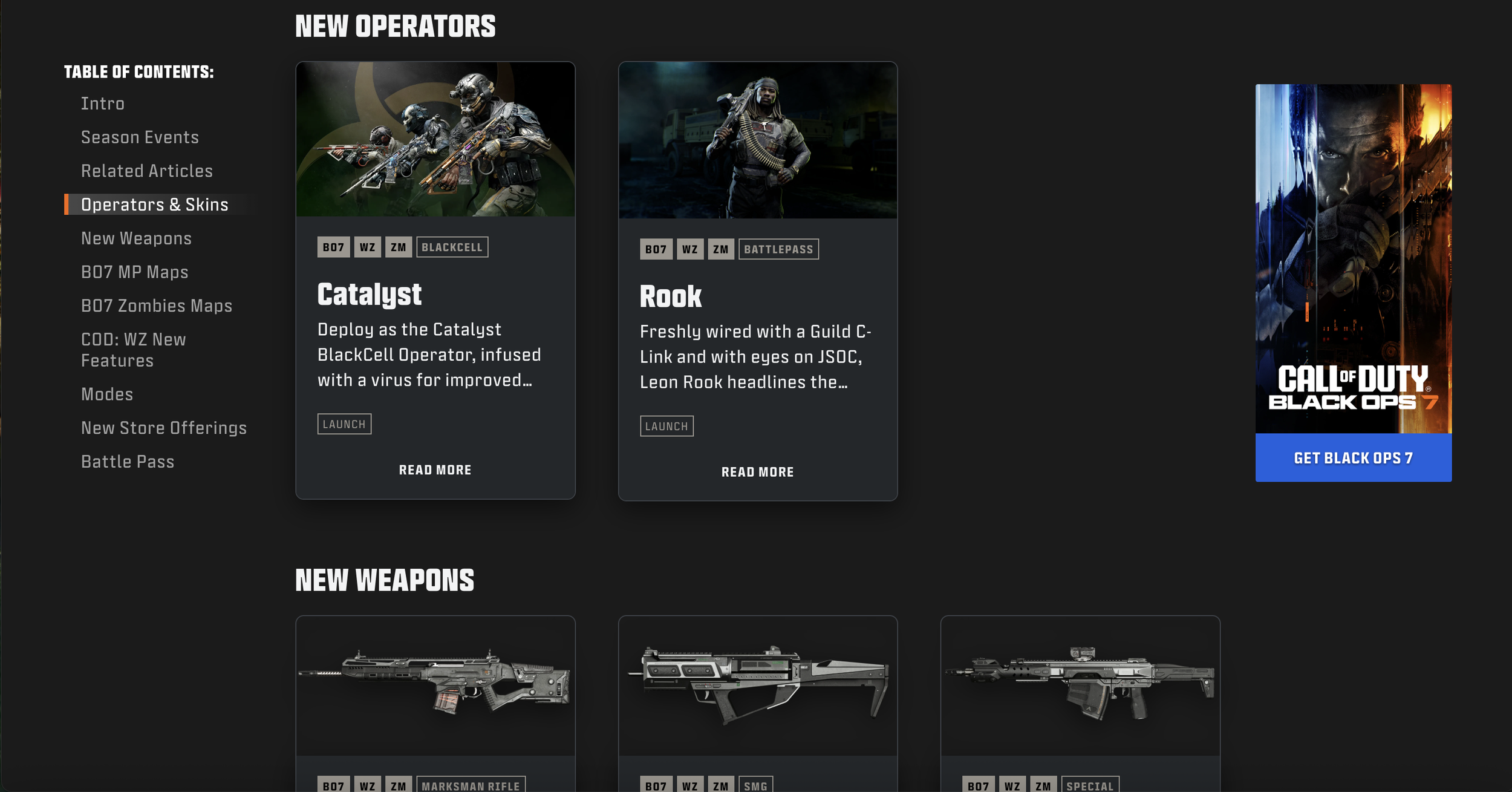
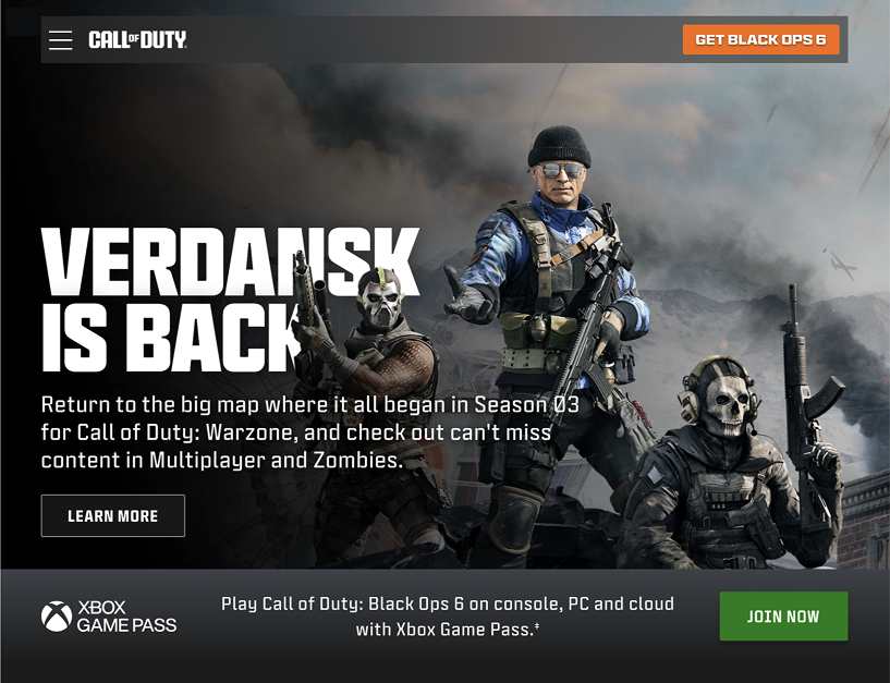
Example Project: Seasonal Content Discovery

Research guided the creation of a new Seasonal page
Problem
Players were not consistently discovering seasonal content and related experiences.
Goal
Increase visibility of relevant content while minimizing cognitive load.
Approach
Evaluated existing information hierarchy
Reviewed player expectations
Tested alternative content structures
Outcome
Established recommendations that improved content visibility and navigation clarity.
Featured content, hierarchy, and appearance based user insights
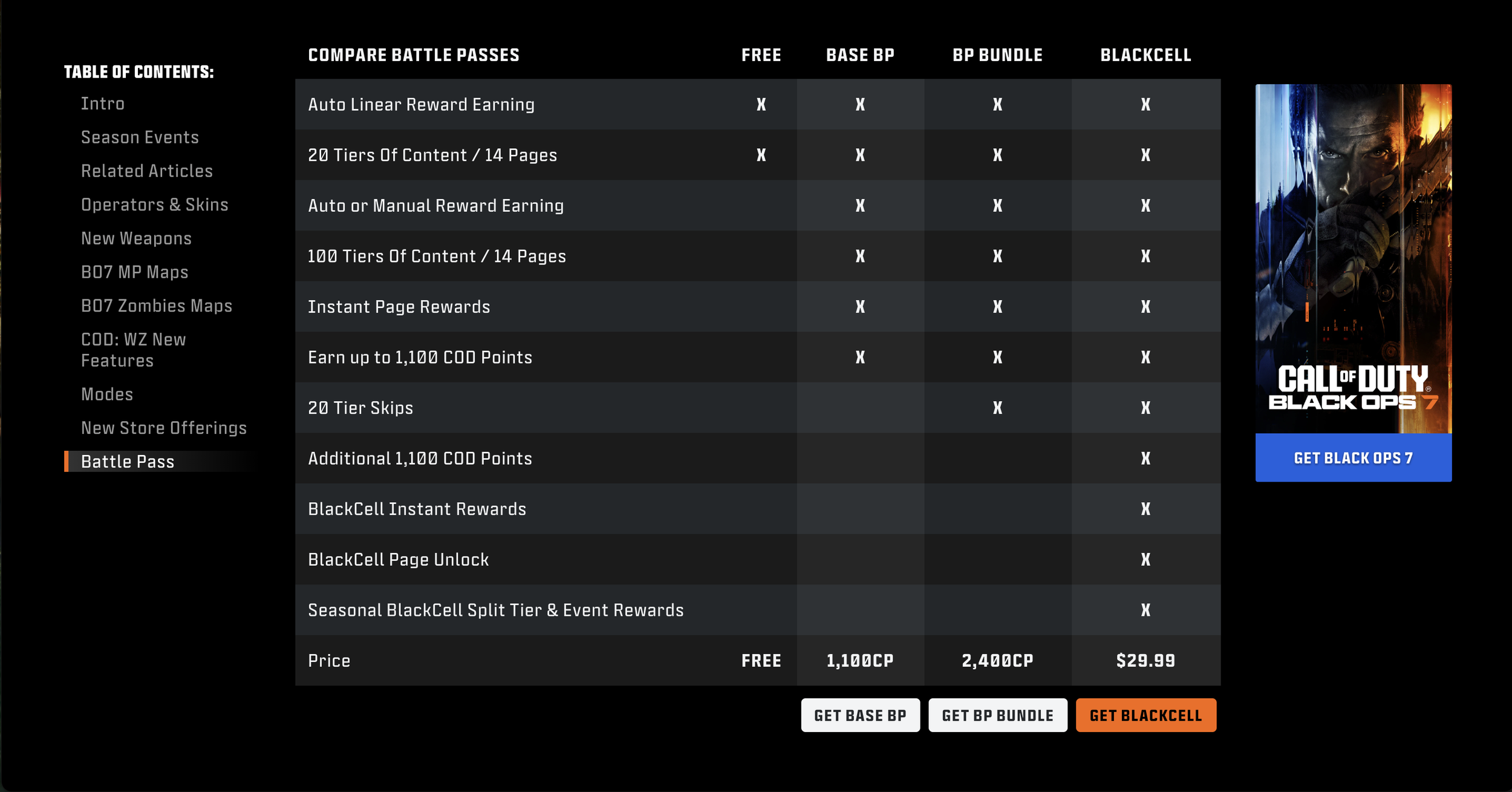
Differences between Battle Passes & Blackcell were a point of confusion for players
Collaboration
One of the most valuable aspects of this work was connecting teams that each held part of the player story.
Key Partners
Analytics
Player Support
Brand
Marketing
Product Stakeholders
Development Teams
My Contributions
Facilitated discovery efforts
Synthesized data from multiple sources
Identified recurring themes
Created research artifacts
Presented findings and recommendations
Aligned stakeholders around evidence-based decisions
Set up Seasonal web content and designed new web pages
This work helped create a shared understanding of player needs across teams.

Seasonal Content Homepage Updates

Documenting flows for Beta Code Redemption
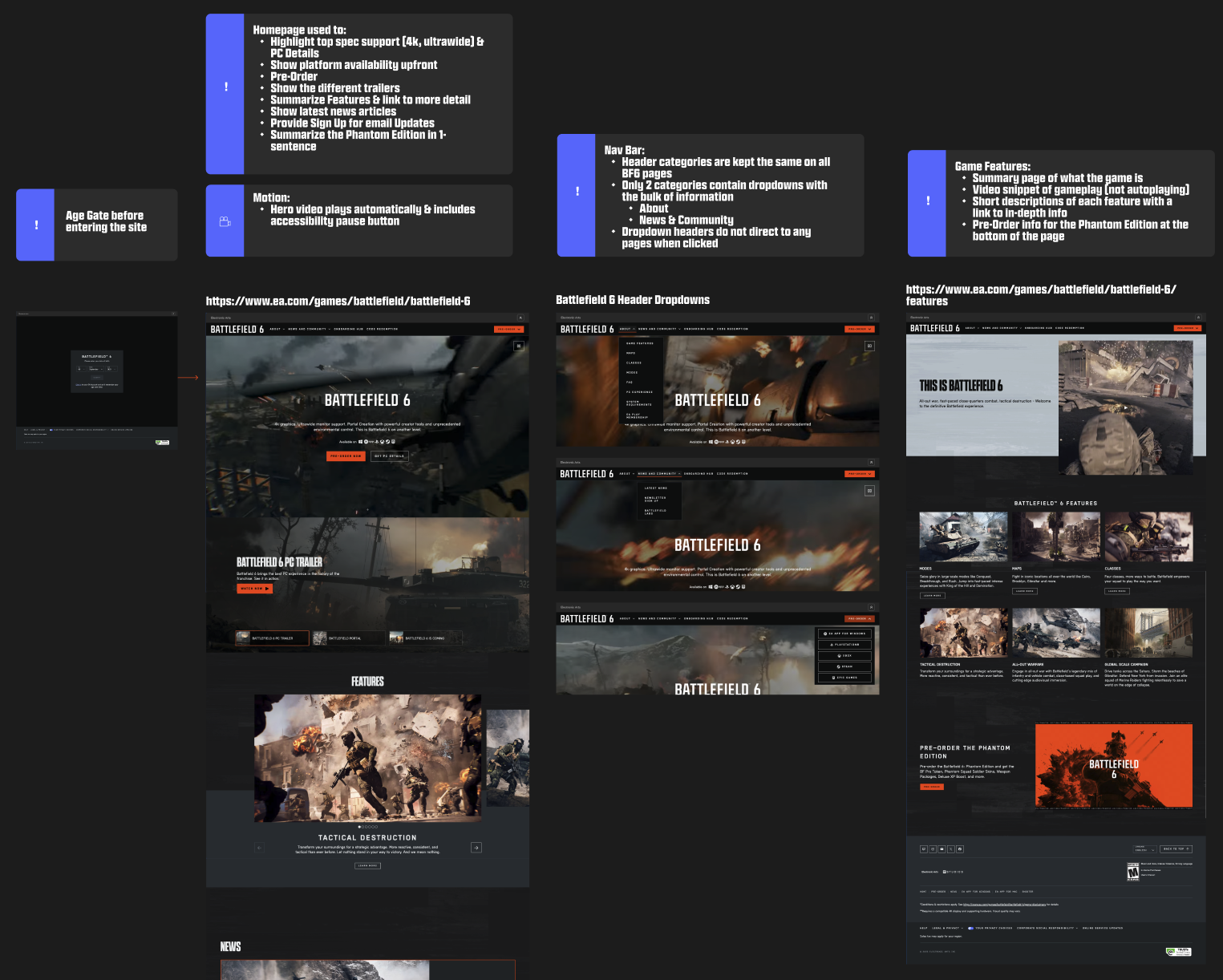
Competitive heuristic analysis

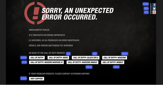
404 Page redesign
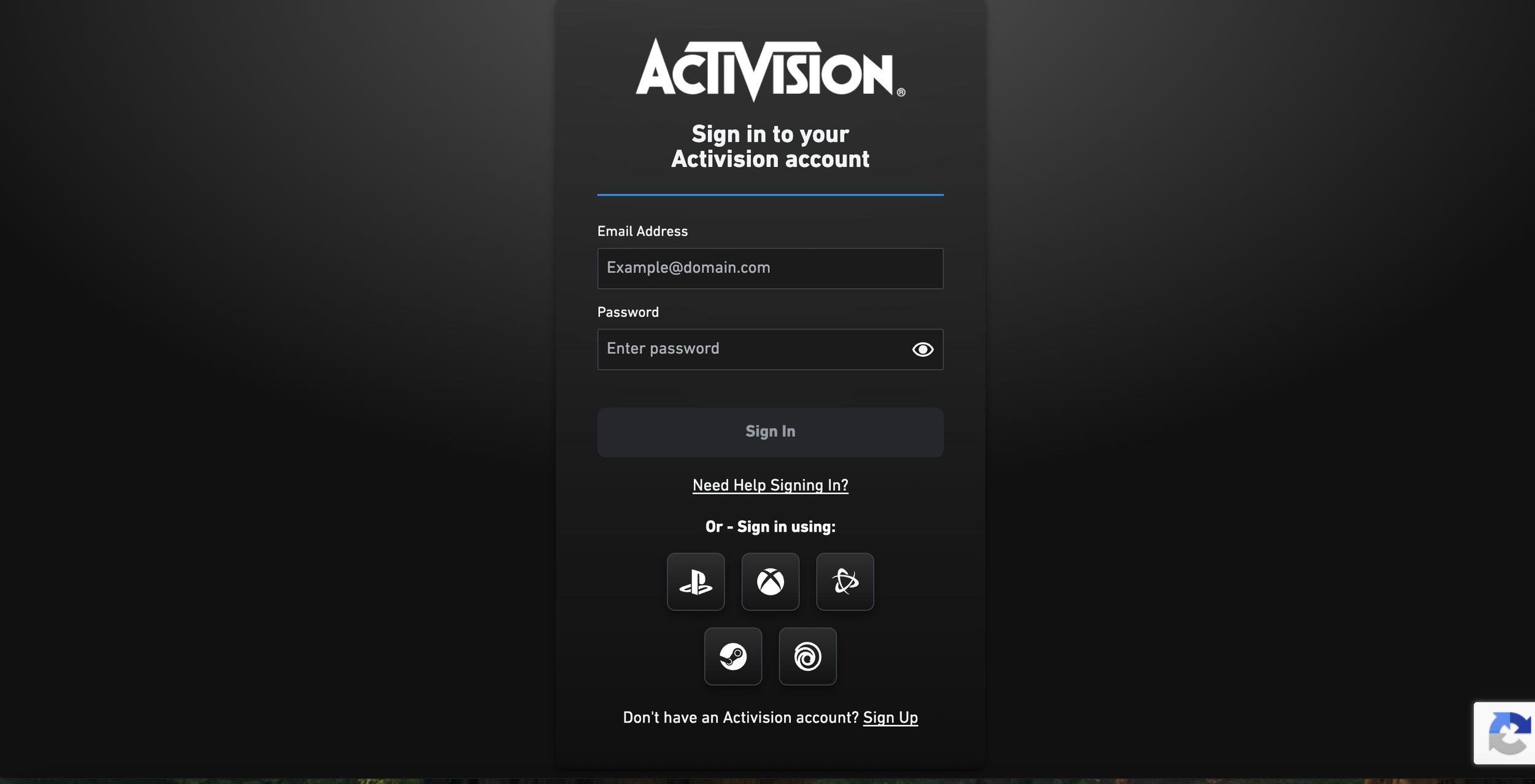
Activision Login / SignUp / Accounts
Hero image creation, banners, and copy edits
Outcomes
Organizational Impact
Introduced a structured research process
Increased stakeholder access to player insights
Created repeatable discovery practices
Improved collaboration between previously siloed teams
Product Impact
Informed design and content decisions
Improved understanding of player behaviors and motivations
Reduced uncertainty during early-stage product exploration
Team Impact
Established stronger evidence-based decision-making practices
Created reusable research frameworks for future initiatives
reflection
This project fundamentally changed how I think about product discovery.
The most valuable outcome wasn't a redesigned page or a new feature—it was creating a system that helped teams better understand players before making decisions.
By combining qualitative research, behavioral analytics, support data, and stakeholder knowledge, we were able to move beyond assumptions and create a more informed approach to product development.
The experience strengthened my ability to lead discovery efforts, align cross-functional teams, and translate research into actionable product decisions.