Kerbal Space Program 2
UX Designer • Intercept Games
2021-2022
Reducing Complexity and Improving Player Understanding in a Deep Simulation Experience

Role◈
UX Designer
Documentation
Product Owner for Tutorials
Team◉◌◉
Design
Engineering
Art
Production
Publishing
Platform▣
PC
Impact snapshot
Systems UX
Improved player understanding of complex game systems
Information Architecture
Organized critical information for faster decision making
User Experience
Reduced cognitive load during gameplay
Collaboration
Worked closely with design, engineering, and production
Accessibility
Improved clarity and usability across key interfaces
the challenge
Jeb could never say “No” to a challenge.
Kerbal Space Program 2 is built around highly complex systems.
Players are expected to:
Build spacecraft
Understand engineering concepts
Navigate layered information
Plan missions
Manage resources
Learn interconnected mechanics
While complexity is part of the game’s appeal, excessive friction can prevent players from understanding systems well enough to engage successfully.
The challenge was not simplifying the game.
The challenge was helping players understand it.
understanding the problem

It’s not Rocket Science…oh wait.
Before exploring solutions, I focused on identifying where complexity became friction.
Business Goals
Improve usability
Reduce player confusion
Support onboarding and learning
Increase confidence in core systems
User Goals
Players wanted to:
Understand available options for crafting & play
Make informed decisions
Learn systems efficiently
Focus on solving problems rather than fighting the interface
Constraints
Large amounts of information needed to remain visible
Existing game systems could not be fundamentally altered
Technical limitations
Deep simulation audience with varying levels of expertise
This meant the solution could not be “remove complexity”.
The solution had to be “organize complexity”.
Discovery
To understand player needs, I reviewed:
Existing workflows
Interface pain points
Gameplay requirements
Stakeholder goals
Community feedback
Competitive references
The goal was to identify moments where information hierarchy broke down and players struggled to interpret available data.
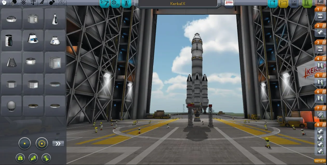
VAB - Could we make finding the right Part for building easier ?
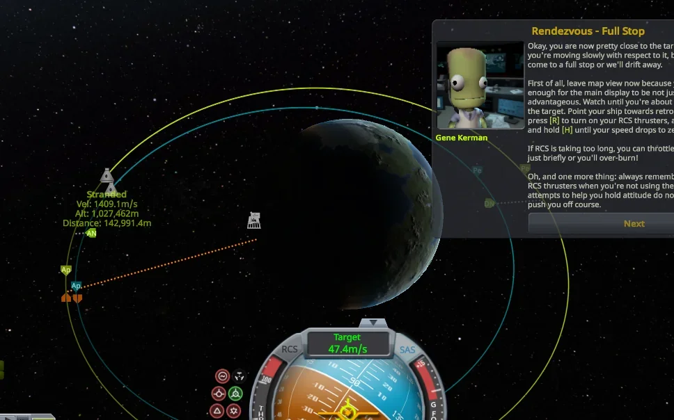
Tutorials - Notoriously intimidating for new players
Key Insights

Scientist is eating good with these Insights.
Insight 1
Players often needed to make decision quickly while processing large amounts of information.
Important information was not always visually prioritized.
Insight 2
Not all information carries equal value.
Interfaces often presented critical and secondary information with similar visual weight.
Insight 3
Experienced players could often work around complexity.
Newer players lacked the mental models needed to interpret systems effectively.
Insight 4
Reducing cognitive load does not require removing information.
It often requires improving hierarchy, grouping, and presentation.
tradeoffs & constraints
The challenge was balancing the needs of experienced simulation players who wanted immediate access to detailed information with new players who required stronger guidance.
Rather than removing complexity, we focused on improving hierarchy and progressive disclosure so players could access information at the right moment.
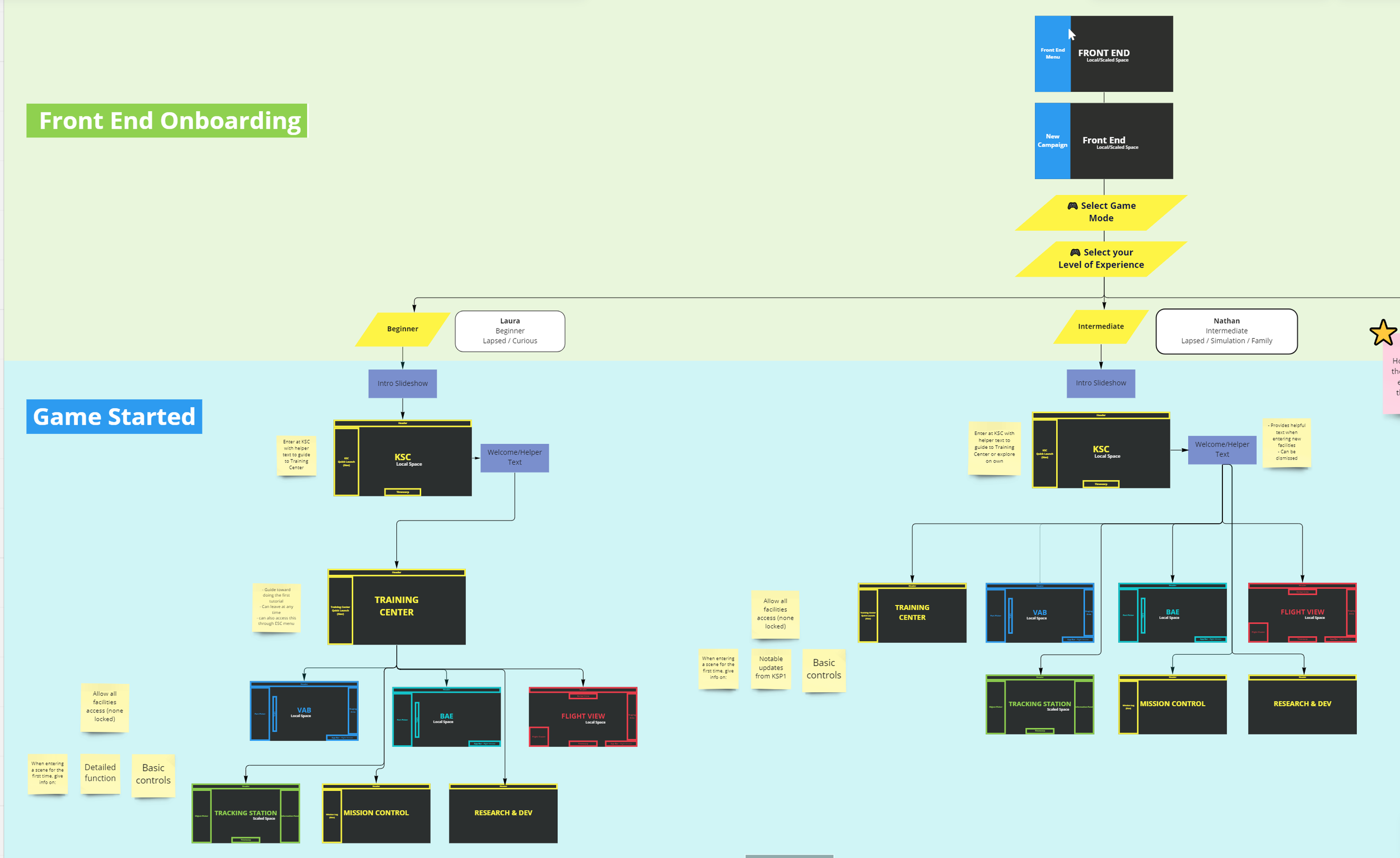
Considering the onboarding flows for varying experience levels.

Mapping one Persona’s user journey into gameplay.
Design Principles
Cleared for take-off.
Several principles guided the work.
Prioritize Signal Over Noise
Important information should stand out immediately.
Support Learning
Interfaces should help players build understanding over time.
Reduce Cognitive Load
Information should be grouped and organized.
Preserve Depth
Information should be grouped and organized logically.
Exploring solutions
Several approachable were evaluated.
Option A
Expose all available information for Parts simultaneously.
Risk: Overwhelming newer players.
Option B
Hide advanced information behind additional interactions.
Risk: Increased navigation effort for experienced users.
Option C
Improve hierarchy while maintaining access to depth.
*This became the preferred direction.
Example Project: VEhicle Assembly Interface
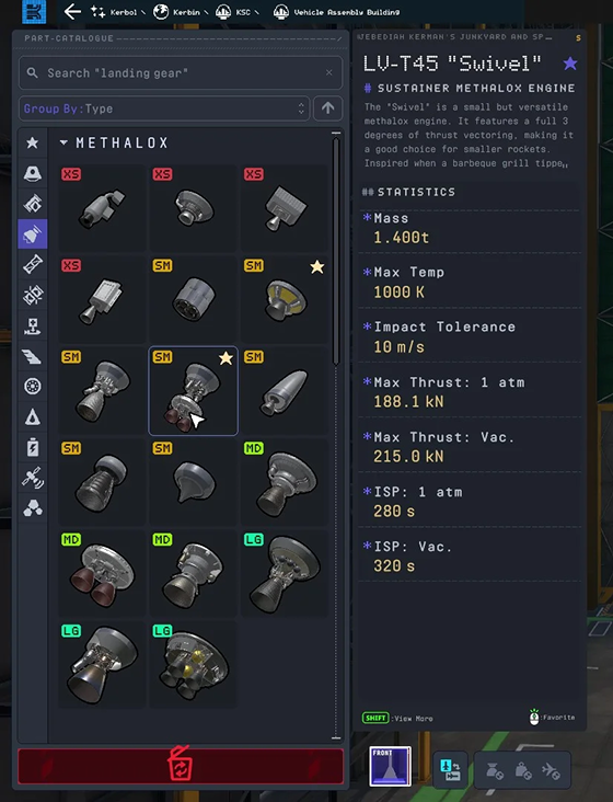
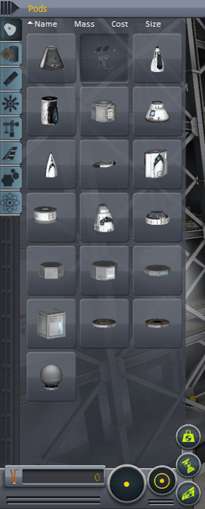
Side-by-side comparison of VAB part catalogs
(KSP2, KSP1)
Problem
Players needed to process large amounts of information while building spacecraft.
Important decisions were often buried among secondary information.
Goal
Improve information hierarchy and decision support during construction workflows.
Approach
Evaluated task flow
Identified critical decision points
Prioritized information based on player needs
Simplified visual hierarchy
Outcome
Created a clearer experience that better supported player decision making while preserving system depth.
Collaboration
This work required balancing player needs with technical and gameplay requirements.
Stakeholders
Game Design
Production
Engineering
Art
QA
My Contributions
UX Analysis
Flow Creation
Wireframing
Prototyping
Design Review
Cross-functional collaboration
This alignment was critical because changes to interface design often affected multiple gameplay systems simultaneously.
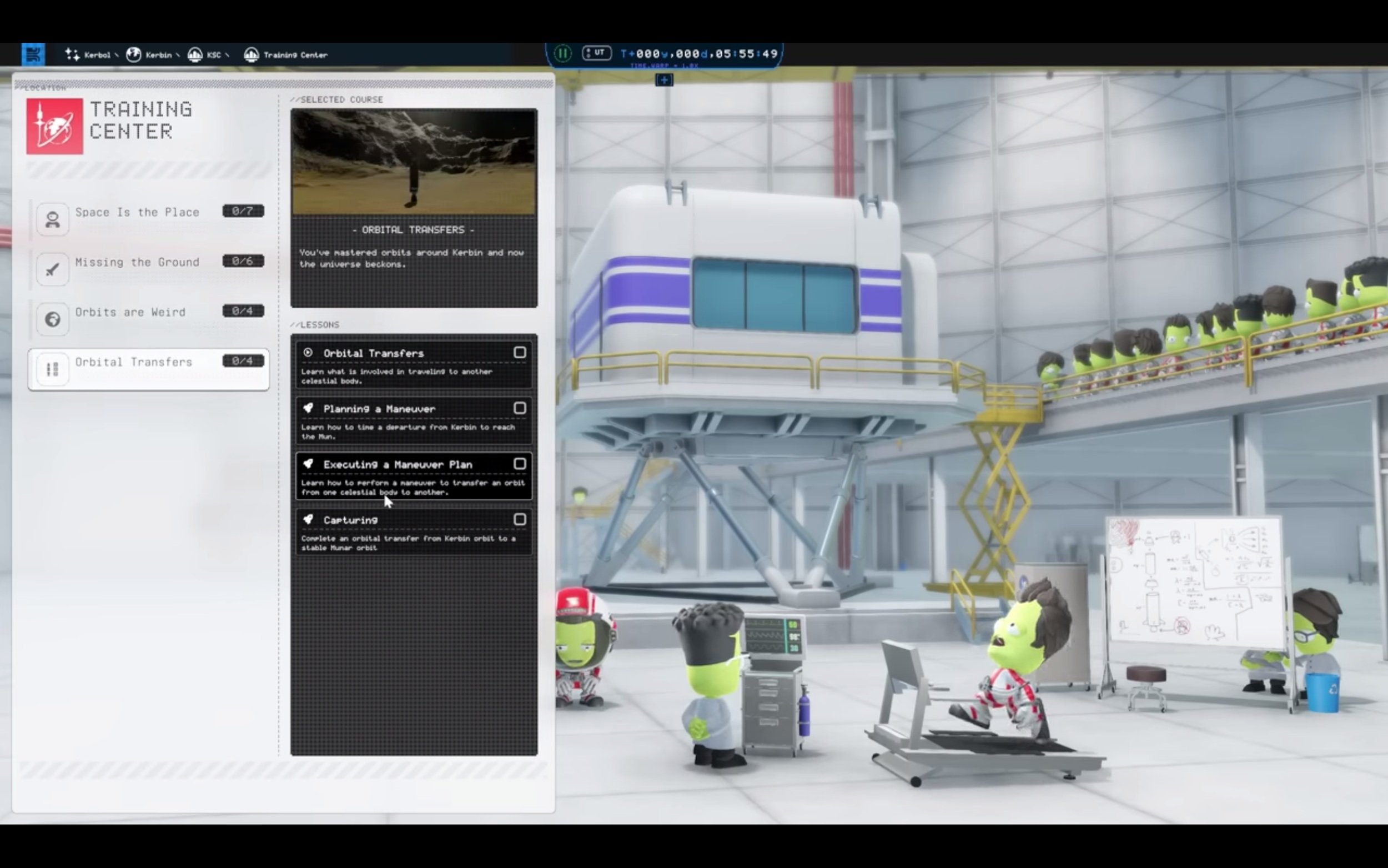
Training Center Menu & Progress Tracker
Video Player Controls
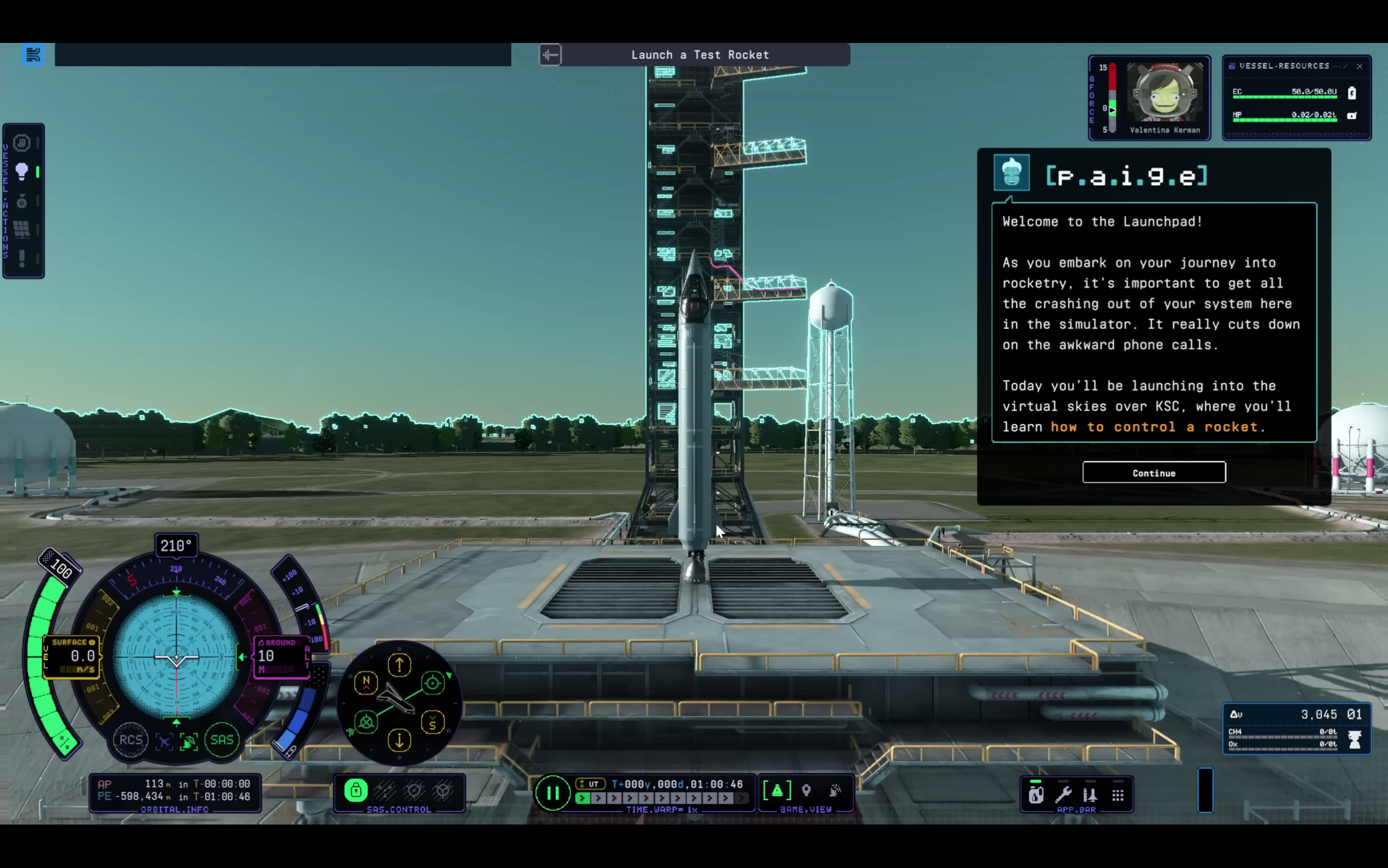
Tutorial Prompt UI, Content & Gameplay
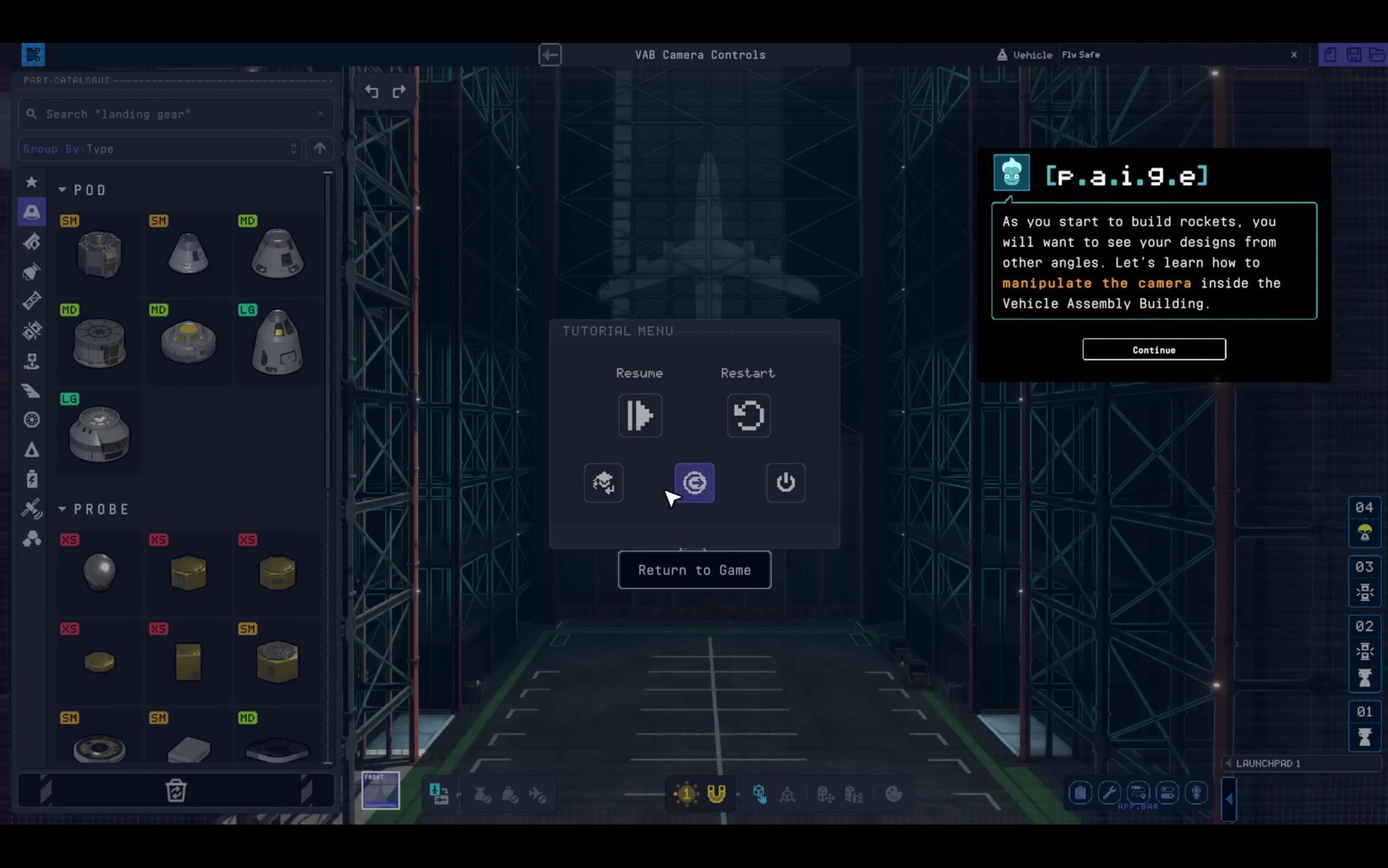
Tutorial Pause Options
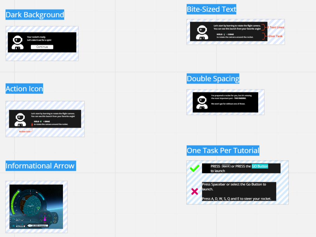
UX Writing Guidelines
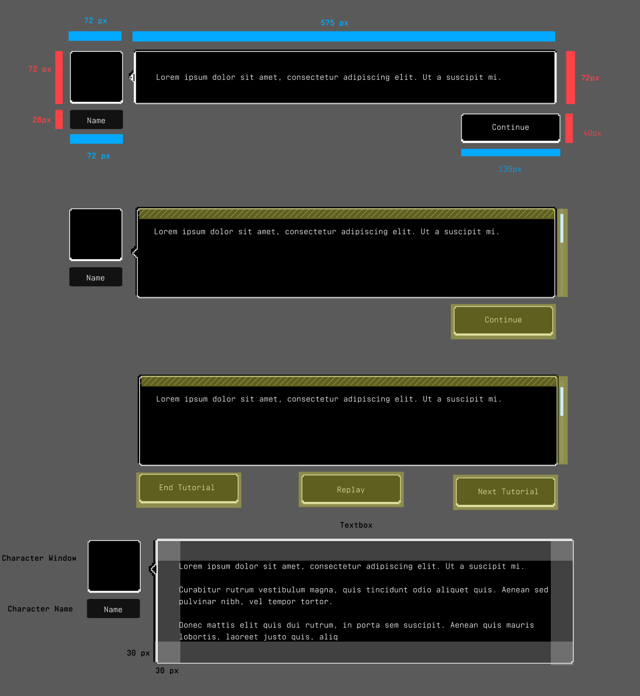
Redlines, Hit Areas, Spacing/Labels
Lesson Video

Entering/Exiting Tutorials
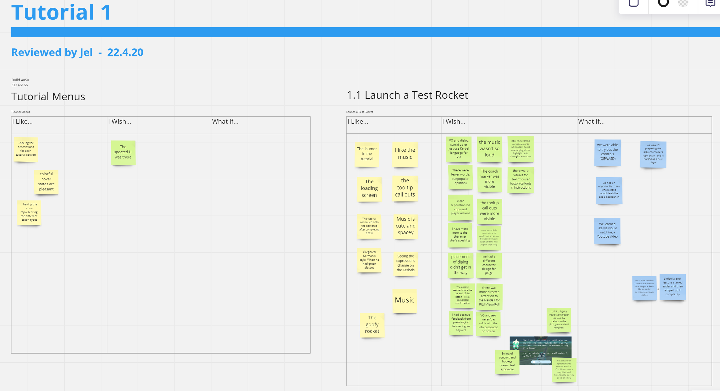
Tutorial Analysis

“Gaining proficiency in Kerbal Space Program can feel almost as complex as becoming a rocket scientist in real life. There’s a lot of theory to wrap your head around if you want your space missions to be successful, even if your crew in this game does happen to be composed of little green cartoon people.
Luckily, KSP2 includes a thorough tutorial system that I cannot recommend enough.”
Outcomes
Player Outcomes
Improved clarity
Reduced friction
Better support for learning
Increased confidence when interacting with systems
Team Outcomes
Shared understanding of usability priorities
Clearer design rationale
More consistent UX patterns
Product Outcomes
Better support for complex simulation gameplay
Improved accessibility of core systems
Stronger information architecture foundation
reflection
Kerbal Space Program 2 reinforced an important UX lesson:
Complexity is not the enemy.
Confusion is.
Players enjoy mastering deep systems when information is presented in a way that supports learning and decision making.
This project strengthened my ability to work within highly technical environments, collaborate across disciplines, and design experiences that make complex systems more approachable without sacrificing depth.