Senior UX Designer • Big Fish Games
2022-2024
Improving Event Participation and Player Understanding in a Live-Service Merge Game
Evermerge


Role◈
UX Design
Discipline Leader
Outsourcing Guidance
Team◉◌◉
Product
Design
Engineering
Analytics
Live Operations
Platform▣
Mobile
Impact snapshot
Discovery
Identified friction points in event participation
UX Design
Improved clarity of event systems and rewards
Collaboration
Partnered with product, design, engineering, offsite UX/UI, and LiveOps
Player Experience
Reduced confusion around progression and objectives
Live Service
Supported engagement and retention goals
The Challenge

This is no time for sleeping.
EverMerge relies heavily on limited-time events to drive engagement and retention.
While events offered valuable rewards and content, players often struggled to understand:
Event objectives
Progression requirements
Reward structures
Available actions
This created friction during onboarding and event participation.
The team wanted to improve player comprehension while supporting overall engagement goals.
UNDERSTANDING THE PROBLEM

Puss in Boots always has a goal in mind.
Before exploring solutions, I worked with stakeholders to understand:
Business Goals
Improve usability
Reduce player confusion
Support onboarding and learning
Increase confidence in core systems
Introduce new event mechanics
User Goals
Players wanted to:
Understand available options for crafting & play
Make informed decisions
Learn systems efficiently
Focus on solving problems rather than fighting the interface
Constraints
Existing event framework already implemented
Live-service release schedules
Mobile screen-space limitations
Need to support multiple event types
This phase helped align product and player goals before moving into design.
Key Insights

Merlin’s Bee Insights
Through reviewing player feedback, existing experiences, and event flows, several themes emerged:
Insight 1:
Players were unsure where to focus their attention after entering an event.
Insight 2:
Progression information was often fragmented across multiple screens.
Insight 3:
Reward structures were not always immediately understandable.
Insight 4:
Experienced players learned systems over time, but newer players faced a steep learning curve.
These insights became the foundation for design decisions.
tradeoffs & constraints

Working with a lot of existing menus, appearances and behaviors
Player Guidance vs. Interface Simplicity
Players needed clearer direction to understand event objectives and progression systems, but adding more instructional content risked increasing visual complexity and reducing the sense of discovery. Rather than introducing additional tutorials or explanatory text, I focused on improving information hierarchy, surfacing critical details at the right moments, and reducing the effort required to understand next steps.
Reinforce Motivation
Rewards and progression should remain visible throughout participation.
design principles
Cognitive Load was a real problem.
Based on findings, I established several guiding principles:
Prioritize Clarity
Players should understand event goals immediately.
Reduce Cognitive Load
Important information should be visible without excessive navigation.
Support Decision Making
Players should understand what actions help them progress.
Reinforce Motivation
Rewards and progression should remain visible throughout participation.
exploring solutions
Instead of immediately jumping into UI execution, I evaluated several approaches.
Option A
Provide more detailed instructional content.
Tradeoff:
More information could increase cognitive load.
Option B
Surface progression and rewards more prominently.
Tradeoff:
Required careful use of limited screen space.
Option C
Restructure information hierarchy.
Tradeoff:
Potential impact on existing player familiarity.
The final direction combined elements from multiple approaches.
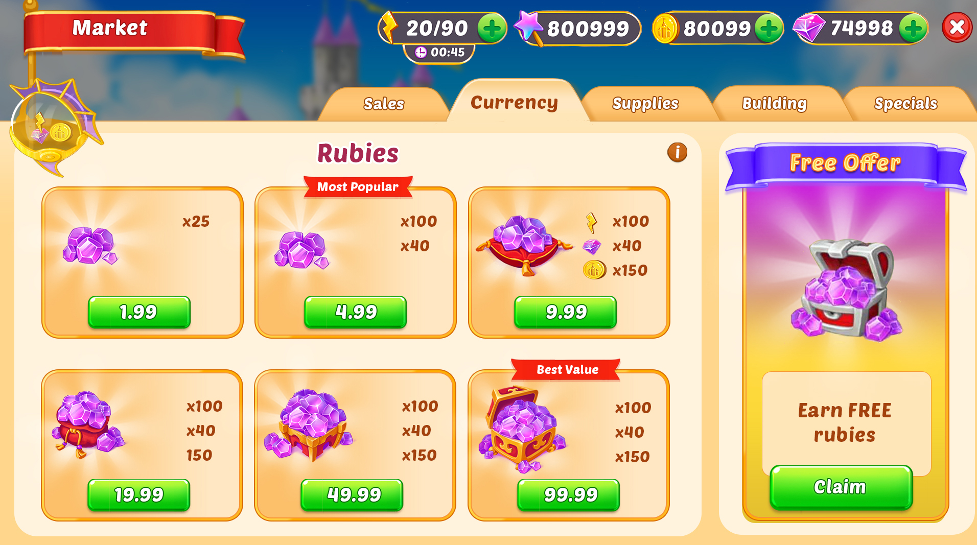
example project: Market experience redesign

V1: Consolidating All Purchasable Currencies in One Tab and Menu
Problem
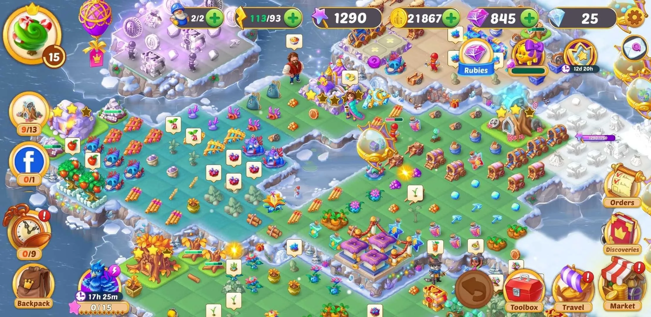
The Market served as a critical destination where players could acquire resources, discover offers, and support progression. However, the experience had evolved over time, resulting in inconsistent organization, competing priorities, and increased cognitive load for players.
Players needed to quickly understand available offerings and identify items relevant to their current goals, while the business required visibility for promotional content and monetization opportunities.
Goal
Improve discoverability and usability within the Market experience while supporting engagement and monetization objectives.
Constraints
Existing economy and offer systems could not be fundamentally changed.
Multiple content types needed to coexist within the same experience.
Mobile screen space was limited.
Promotional content needed to remain visible.
The design needed to scale across future events and offerings.
Approach
I evaluated the existing experience to understand how players navigated available content and where friction occurred.
Key focus areas included:
Information hierarchy
Offer discoverability
Navigation patterns
Content prioritization
Visual organization
Through collaboration with Product, Design, Engineering, and Live Operations stakeholders, I explored opportunities to create a more intuitive structure while preserving business requirements.
I divided updates into 5 different experiments for A/B testing.
Outcome
The redesign created a more organized and scalable Market experience that better supported player decision-making while maintaining the visibility requirements of a live-service economy.
The project reinforced the importance of balancing business objectives with player needs and demonstrated how thoughtful information architecture can improve usability without requiring major system changes.

V2: Adding a Sales Tab for bundled purchases

V3: Updating modal behavior for Low Currency situations
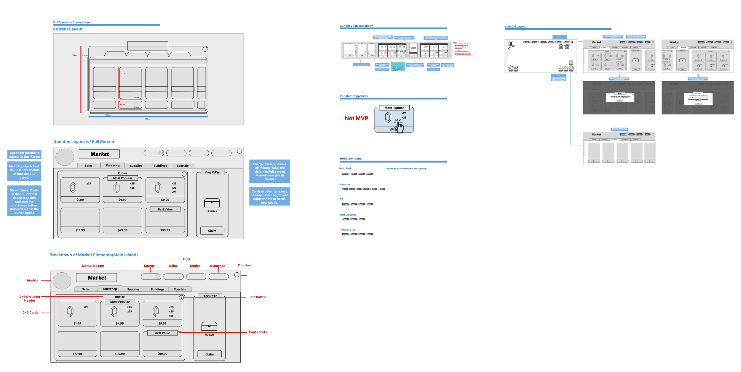
V4: Comparative formatting for Hard Currencies + full screen view
V5: Best Value/Most Popular labels
collaboration
Stakeholders
Product
Live Ops
Engineering
Design
QA
My Contributions
Identified UX opportunities
Facilitated design discussions
Created flows and wireframes
Supported implementation
Iterated based on feedback
Working remotely with 2 different
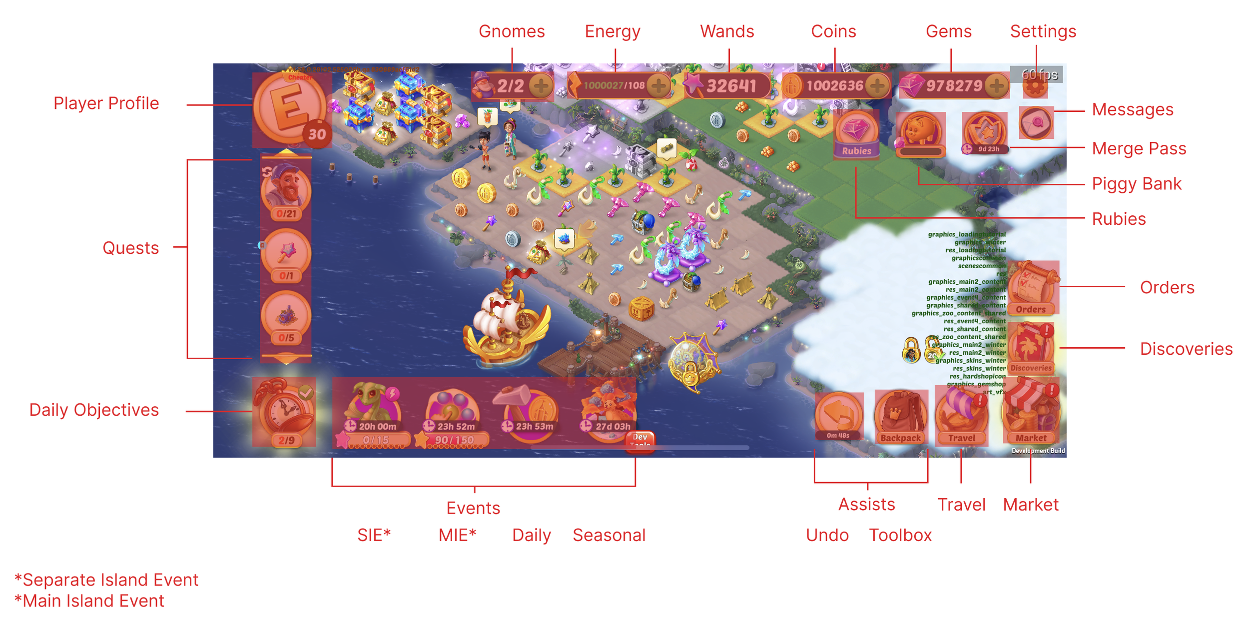
HUD Elements to simplify
Wireframes for full-screen Marketplace

Competitive Analysis
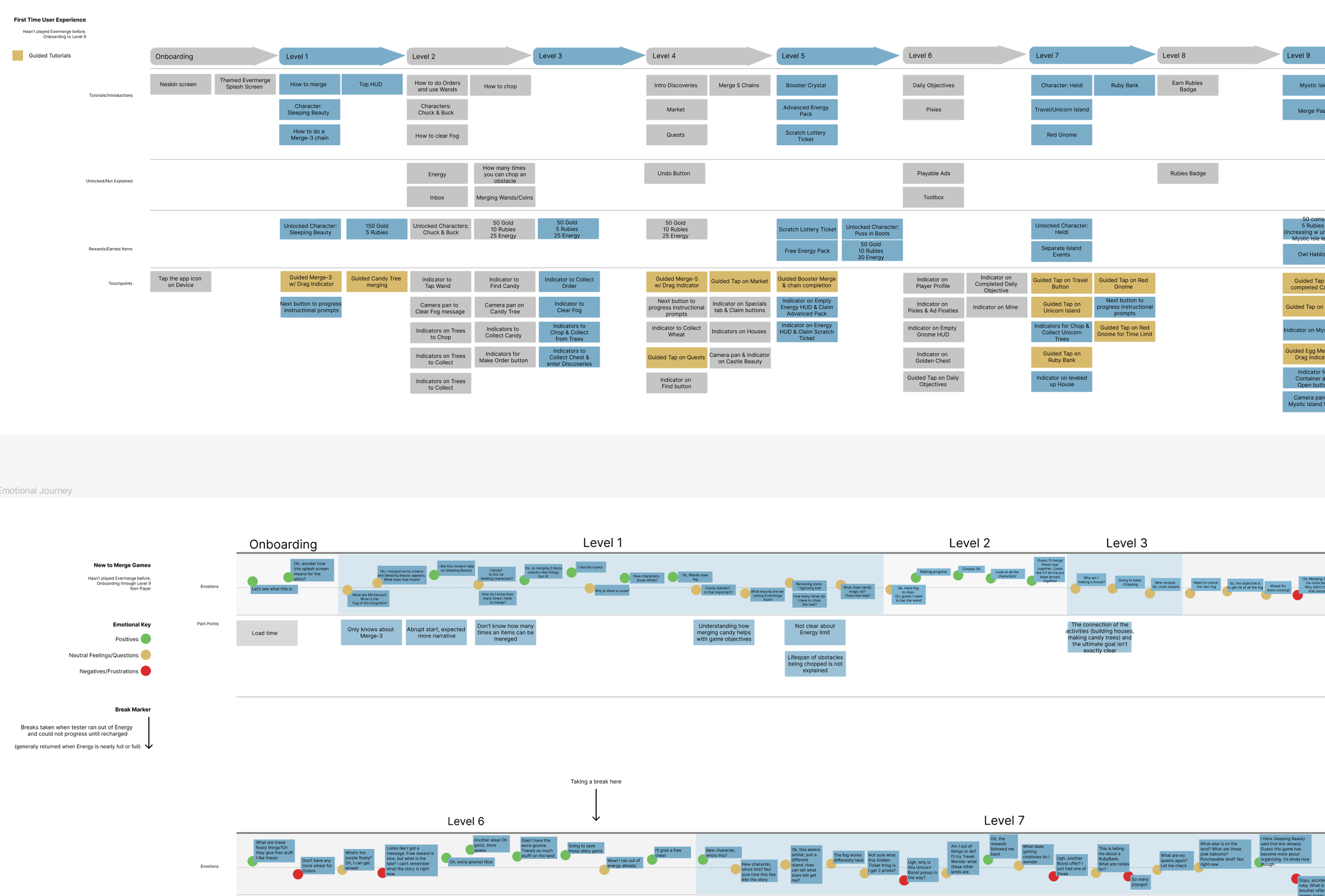
Tutorial Assessment for Flow/Inconsistencies/Improvement areas
Combining 3 Marketplaces into Consolidated Marketplace
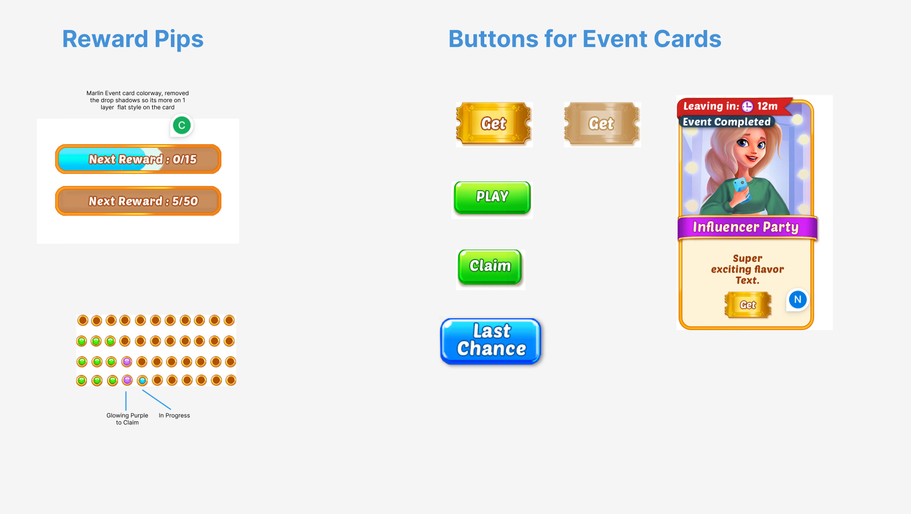
Designed new Events reward system

Figma Prototype for the V4 Market.
outcomes
Organizational Outcomes
Improved alignment around event UX goals
Established clearer event experience standards
Created reusable patterns for future events
Player Outcomes
Reduced ambiguity around event participation
Improved visibility of progression systems
Increased confidence in decision making
reflection
This project reinforced the importance of balancing business goals with player comprehension in live-service environments. While events are designed to drive engagement, long-term success depends on helping players understand progression systems quickly and confidently.
The experience strengthened my ability to design within highly constrained live-service frameworks while collaborating across multiple disciplines.